Monday, 25 February 2013
Sunday, 24 February 2013
Demographic Research (posters)
These pie charts accurately show the out come of a serious of questions asked to a focus group about the posters. The focus group had seen the magazine and the trailer prior to the questioning. These questions help us better understand what our audience wants and what is the most affective method of advertising our film.
Saturday, 23 February 2013
Poster Servay
Wednesday, 20 February 2013
Poster creation
Sunday, 17 February 2013
Magazine, final draft
This describes why we chose to use certain specific conventions for attracting customers to both the film and the magazine.
Each magazine cover is designed to hook and draw In the audience. With small sneak peek releases in each magazine we will make the audience feel curious. By having several editions for each magazine and each character it make the public more aware of the film than they. Would be from just one magazine. By seeing four magazine covers from the same film it tells the audience that the story of each person is equally important as the other characters and the way it is presented in this fragmented way may cause the film to stick in the mind of the passer by.
 |
| Cover number 1 |
 |
| Cover number 2 |
Each magazine cover is designed to hook and draw In the audience. With small sneak peek releases in each magazine we will make the audience feel curious. By having several editions for each magazine and each character it make the public more aware of the film than they. Would be from just one magazine. By seeing four magazine covers from the same film it tells the audience that the story of each person is equally important as the other characters and the way it is presented in this fragmented way may cause the film to stick in the mind of the passer by.
Wednesday, 6 February 2013
Editing plan
Types of editing that will be used:
- Quick cutting
- Match on acition
- Transitions
- Effects
- Cutting
- Voice overs
- Back ground muisc
- Diagectic sound
- Non-Diagetic sound

The editing process that we will start will envolve all of these conventions we plan to have a jumpy trailer that uses quick cutting to create and unnerving atmosphere for the viewer. However we would like to start the trailer with slow highly lite scenes and shots of the characters to lul the audience into a fails sense of security. This will evolve happy music that keeps the audiences spirits high, then we will have a sudden change of style. The cutting will become quick and the transitions will be fast as well. We plan to cut moments of the death scenes with one of the blogs talking about the ghost hunt and other moments in the film like when strange things start to happen. Diagectic sound will be used for things like voices and non diagectic to create the atmosphere, the idea is that if the audience is made to feel u easy just from the trailer then they will be impressed and want to go see the film, much like what the paranormal activity 2 trailer does.the 180 degree rule will always be applied as well as shot reverse shot where it is needed. We plan to use shot reverse shot in one part of the trailer when John talks with James this is the only face to face convocation in the entire film so it is important to pay attention to the 180 degree rules so we do not confuse the audience. Match on action will be used carefully throughout the editing process especially in the scene that involve going through doors much like in the beginning of the science room scene when the ghost is first sighted. These rules such as match on action and shot reverse shot are vital for the trailer not just because they keep a film looking professional but because with out them it could annoy and confuse the audience and put them off coming to see the film so it is vital we get it write, the editing process is often the most important part of the production of the trailer.

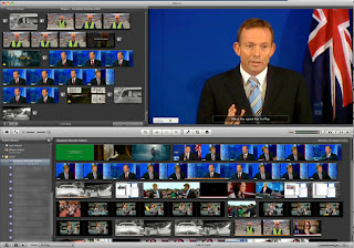
The softwear we will be using to edit this film is i movie, an apple made peice of softwear it is capable of performing many tasks as once, such as processing a video while a sound track is being searched for. We are fermilliar with Imovie which is one of the main reasons we are using it. It constantly backs its self up, so no need to worry about loosing files. The layout is simple and easy to follow as are the controls and technique which makes it perfect for editing out short trailer.
Monday, 4 February 2013
Filming plan
 |
| Point of veiw Shot |
The point of veiw shot will be used mostly as the cameras are hand held and the story calls for all the characters to be holding a camera filming the action at all times. By using the one hundred and eighty degree rule we can ensure that no audience member will be confused by the shots that we take so we will have to be extremely careful as very few of the scenes that we shoot will have fixed cameras.
 |
| Mid Shot or Medium Shot |
Another scene we will shoot is of the entire cast first entering the empty school. We are going to use point of veiw shot for this scene being careful to abided by the ruls of continuity and the 180 degree rule.
 |
| Long Shot |
 |
| Two Shot |
 |
| Close Up |
Planned locations for filming
The art room is one of are places that we have chosen to film in, it has the ability to get dark very quickly which is something we will require for our mise-en-scene. It is an open space and will be relatively empty when we begin filming. It has alot of unfinished peices of art in it so it looks well used and in the dark even looks like its just been abandonded which fits in well with the style of horror film we want to make. It is also in the old part of the building and is therefore more liable to be haunted. The room has several doors that exit the room so it will work well when we are creating affects as some one can create an affect and quickly escape before the camera sees them.
The Food Technology Room
The food technology room is one of the newer rooms so it stands to reason that it would be a safe place to come to escape the ghost. When this room is used in the point in the story the characters dont yet know that the ghost they are running from is the ghost of someone who worked on the site before the work house was knocked down and the school was built, so when they discover this they realise that there is nowhere to hide. The room can also become very dark and being a kitchen can be quite a dangerouse place at times. The room fits the mise en scene well being that it has the capability to get dark with out being toatlly pitch black and is a classroom which is important for a school.
The entrance!
The entrance looks very safe and school like which is what we want. Most horror films lull their audience into a false sense of security before scaring them. This creates a contrast where by you rapidly change the atmosphere the audience are experiencing and the mood they are feeling making them feel very un easy. Unlike women in black the building is not very imposing at all but thats not what we want we want it to look inviting and safe.
The Art Corridor
The art corridor is one of the oldest parts of the original school building and this is reflected in its architecture. In the dark this is amplified by any light wheter it be moon or ambient light shining through the windows creating shadows and beams of light in the corridor. The long corridor mixed with shadows could create a creepy atmosphere.
The science corridor
This is quite an important set as it is where the ghost is sighted and peters character is killed. The lighting during the night is almost pitch black so we plan to have the lighting dark but just light enough to see, this will make for a scary atmosphere much like the set in the film grave encounters. This is also on the site where the work house originally was. The science block has no windows so it adds to the sense of being trapped.

The Stage
This is where the final character dies so it is a very important set. The Stage has no windows or exit doors other than one so it will make the audience feel trapped. The lighting is dark and back stage all that can be seen is a silhouettes. This adds to the high tension and suspense and so it can make the audience feel very uncomfortable and tense.
Camera
This is the camera we are using in the filming process. It is HD and handheld it is a Xacti. We are using this as it is light weight and perfect for our use which is hand held, quick movements and easy to use so for a documentary point of veiw shot type its perfect.
Sunday, 3 February 2013
Audiences and chosen demographic
Target Audience
Being a student film we we're keen to make sure that we could reach as many young people as possible, from the age of 15 to around the age of 21. I wanted to make sure that anything in the film was suitible for a target audience of people as young as 15. Before we thought about scripting i made sure of what was deemed appropriate to be veiwed by a 15 year old audience by checking the BBFC website and they defined a 15 as the following:
To make sure that none of these lines where crossed i also checked how they defined an 18 and this is what they said:
Baring this information in mind we have decided to drop most frequent strong language. The
majority of the film is jumpy rather than gory or violent and it leans more towards a psycological thriller rather than a horror since the violence is minimul.
In order to reach our demographic and sevay our target audience we decided to set up a facebook page from which we could get feed back from our followers and post updates about the film and gage the audiences reaction based on likes and comments. We decided that our film needed to be backed by a film company in order to reach more people and gain some valuable credibility, so we founded Pfab our film company, the logo of which can be seen in the banner photo of the facebook page.
Subscribe to:
Comments (Atom)


